A single decking color across an entire surface is a safe choice, and it can look perfectly fine. But a second tone, used with intention, turns that same surface into something people notice from the moment they step outside. Borders sharpen the edges, contrasting inlays mark out zones, and railings in a complementary shade tie the whole structure to the house. This blog outlines how two-tone designs work, which pairings hold up over time, and how to use color without the finished deck looking busy.
Key Takeaways
- A second decking color defines edges, zones, and level changes without adding structure.
- Picture frame borders are the simplest and most reliable place to introduce contrast.
- Railings, posts, and fascia are natural spots for a complementary rather than matching tone.
- Two colors are usually plenty, since a third tends to make the design feel unsettled.
- Board layout has to be planned before installation, so decide on the pattern early.
Why Two-Tone Decks Have Caught On
Composite decking arrives in a range of colors deep enough that limiting a project to one shade started to feel like a missed opportunity. Homeowners noticed how a darker border framed a lighter field the way trim frames a room, and designers noticed that contrast could do the work of dividing a large deck without adding railings or level changes. The look caught on quickly because it delivers a custom result using materials that were already on the plan.
There is a practical dimension too. Large single-color decks can read as flat and endless, particularly on properties where the deck footprint is generous. Introducing a second tone breaks that expanse into readable sections, gives the eye something to follow, and makes the whole structure feel deliberately composed. The effect is strongest from inside the house, where the deck is often viewed through a window as a single frame.
How Contrast Actually Works Outdoors
Most two-tone deck ideas succeed or fail on one principle: contrast needs a clear job to do. A second color that traces the perimeter reads as a border. One that marks a step, a landing, or the transition into a dining area reads as a wayfinding cue. A second color scattered without logic simply reads as indecision. Before choosing shades, it helps to decide what the contrast is meant to communicate about the space.
Outdoor light also behaves differently than showroom light. Bright sun flattens subtle differences, so a pairing that looked distinct on a sample board can vanish once installed across a wide surface. Deeper contrast usually holds up better outdoors, particularly on decks that catch full afternoon sun. Viewing samples on site at different hours of the day is the most reliable way to know what you are really getting.
Picture Frame Borders and Inlay Patterns
The picture frame border is the most popular entry point, and it earns that position. A band of contrasting decking runs around the outside edge, the field boards run inside it, and the cut ends disappear beneath the border for a much cleaner finish. Doubling the border adds weight to the frame, and carrying the same tone onto the stair treads or fascia extends the effect down the sides of the structure.
Beyond the border, inlays open up more possibilities. A contrasting band can mark the threshold at the back door, outline a hot tub pad, or define the boundary of a dining zone. Diagonal fields, herringbone sections, and simple geometric insets all add character when used sparingly. The restraint matters, because one focal pattern anchors a deck while three competing ones make it difficult to look at.
Board Direction and Visual Flow
Direction influences perception as much as color does. Boards running perpendicular to the house tend to make a deck feel deeper, while boards running parallel emphasize width. Changing direction between two color fields creates a distinct break between areas, which is useful when separating cooking from lounging. Any change in direction needs framing support underneath, so these decisions belong in the plan rather than the installation.
Pairing Decking With Railings, Posts, and Fascia
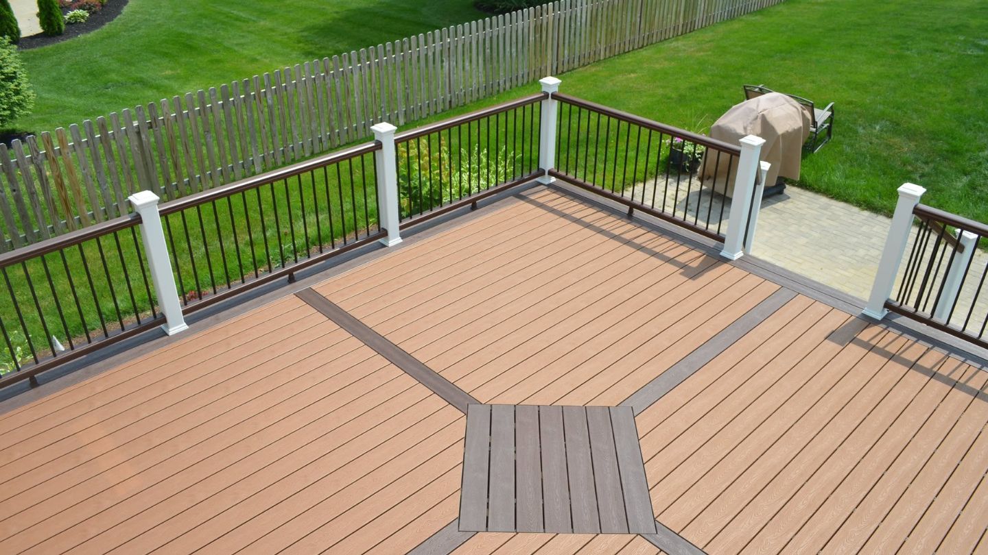
Working out how to mix deck colors and materials for a two-tone deck usually starts above the surface. Railings sit at eye level and occupy more of the view than the decking does from most angles, which makes them a powerful place to introduce contrast. Dark railings against a light deck produce a crisp, modern outline. Light railings over a darker field feel airier and interfere less with a view worth keeping.
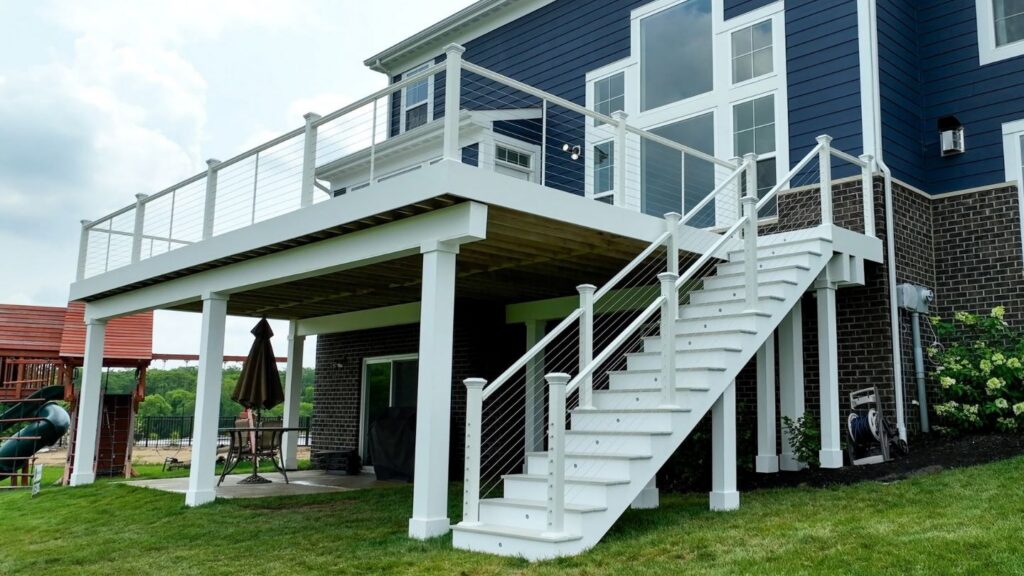
Materials can vary alongside color. Composite decking pairs comfortably with aluminum railing, cable infill, or composite posts wrapped to match the border, and each combination changes the character of the finished deck. The trick is limiting the palette overall. Two decking tones plus one railing treatment usually looks intentional, while adding a fourth element starts to feel unresolved no matter how good each piece looks alone.
Color Pairings Worth Considering
The best color combinations for two-tone decking generally follow one of two paths. The first keeps both tones within the same family, pairing a mid-toned field with a noticeably deeper border for a layered, subtle result that suits traditional homes. The second reaches for genuine contrast, such as a warm field against a charcoal frame, producing a sharper look that sits well with contemporary architecture and darker exterior trim.
Your home’s exterior should have the final say. Siding, stone, roof color, and window trim all surround the deck permanently, and a pairing chosen in isolation can end up competing with them. Pulling one tone from an existing exterior element and letting the second provide the contrast is a dependable approach that keeps the deck looking like part of the house rather than a separate project.
Keeping Family Spaces in Mind
Color choices carry practical consequences for households with children or pets. Lighter tones stay cooler underfoot in full sun, which matters on a deck where bare feet and paws are constant. Darker surfaces disguise everyday marks more effectively. Using a lighter field with a darker border often captures both benefits at once, and it pairs naturally with the other considerations behind designing pet and kid-friendly decks, such as railing infill and stair proportions.
Using Color to Support Safety
Contrast is genuinely useful, not just decorative. A different tone on stair treads makes each step read clearly at dusk, and a contrasting band at the edge of a raised platform signals a level change before someone reaches it. These cues cost nothing extra when they are part of the original layout, and they work alongside the safety features builders incorporate into deck designs like graspable handrails, proper baluster spacing, and integrated stair lighting.
Working With the Yard Around It
A deck never exists on its own. Mature trees, garden beds, stone walls, patios, and fencing all sit within the same frame, and they influence which pairing looks right. Warm tones settle comfortably into heavily planted yards, while cooler grays and charcoals hold their own against stone and modern hardscaping. Because landscaping choices influence deck design and flow, it pays to consider the two together rather than treating the yard as a backdrop.
Seasons matter as well. A palette that looks striking against summer greenery still has to work in November when the leaves are down, and the yard is bare. Tones with some warmth in them tend to carry through the cooler months better than very cool grays, which can feel stark against a winter landscape. Thinking across the full year leads to choices you stay happy with.
Getting the Details Settled Early
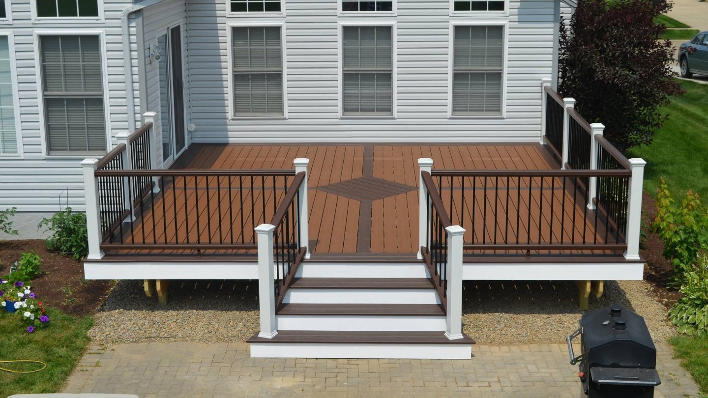
Two-tone deck design ideas for mixing colors and materials depend on decisions made before a single board is fastened. Border widths, inlay locations, direction changes, and stair detailing all require blocking and framing support in the right places. Sorting this out during design costs nothing and is very much part of what to consider when designing your dream deck, whereas discovering it mid-installation means compromising the pattern or rebuilding the frame.
Material ordering follows the same logic. Border and field boards come from separate color runs and different quantities, and accurate takeoffs prevent both shortages and expensive leftovers. A builder working from a finalized pattern can calculate this precisely, which keeps the project moving and the color consistent across every board on the deck.
Designing a Deck That Looks Right From Every Angle
A two-tone deck succeeds when every color decision has a purpose behind it. Borders frame the structure, contrast marks the transitions that matter, railings tie the deck back to the house, and the palette stays tight enough to feel calm rather than busy. Pair those choices with your home’s exterior and the surrounding yard, settle the pattern before construction, and the finished deck will look composed from the driveway, the kitchen window, and the seat you use most.
If you are exploring deck designing in Columbus and want a second opinion on colors and materials, Woodland Deck Company is glad to help you work through it. Our team takes on custom deck remodeling and redecking projects, designs pergolas and shade structures that carry your palette overhead, and installs deck lights that highlight borders and stairs after dark. Contact us with a few photos of your home, and we will help you land on a combination you will still love years from now.